In taste united.
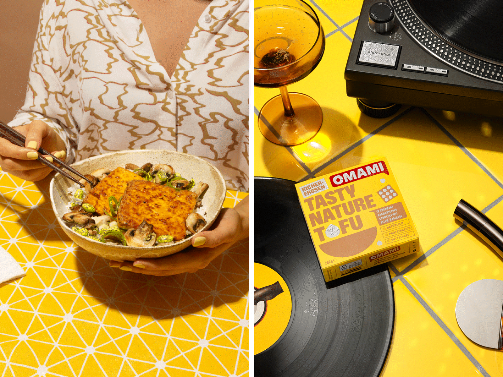
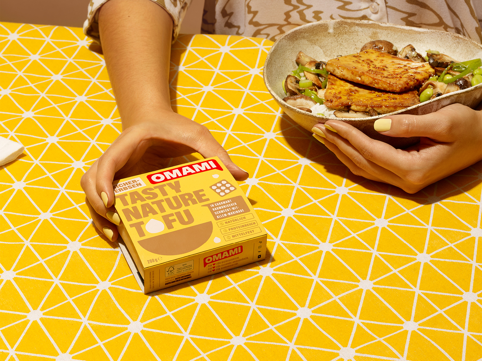
OMAMI has launched the first chickpea tofu in five sophisticated flavors thanks to revolutionary marinades. The Berlin-based tofu brand aims to establish its own category in food retail and a new food culture.
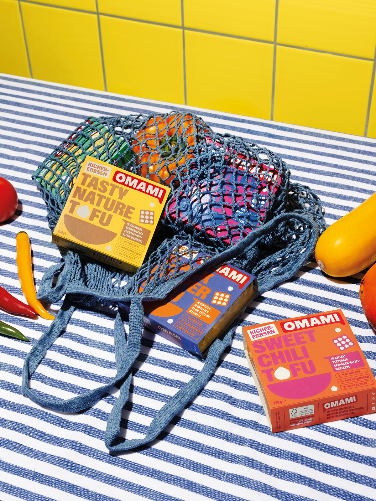
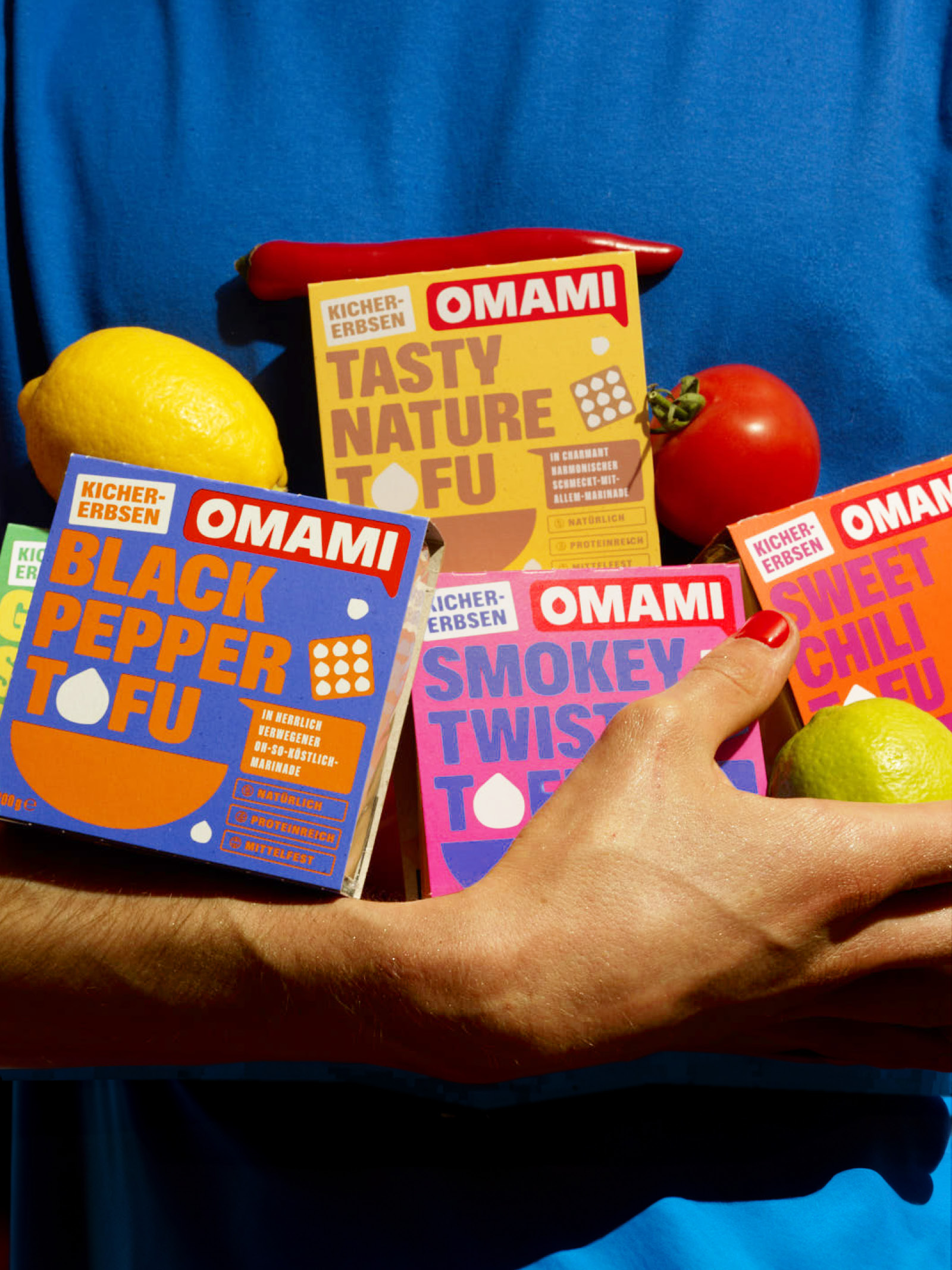
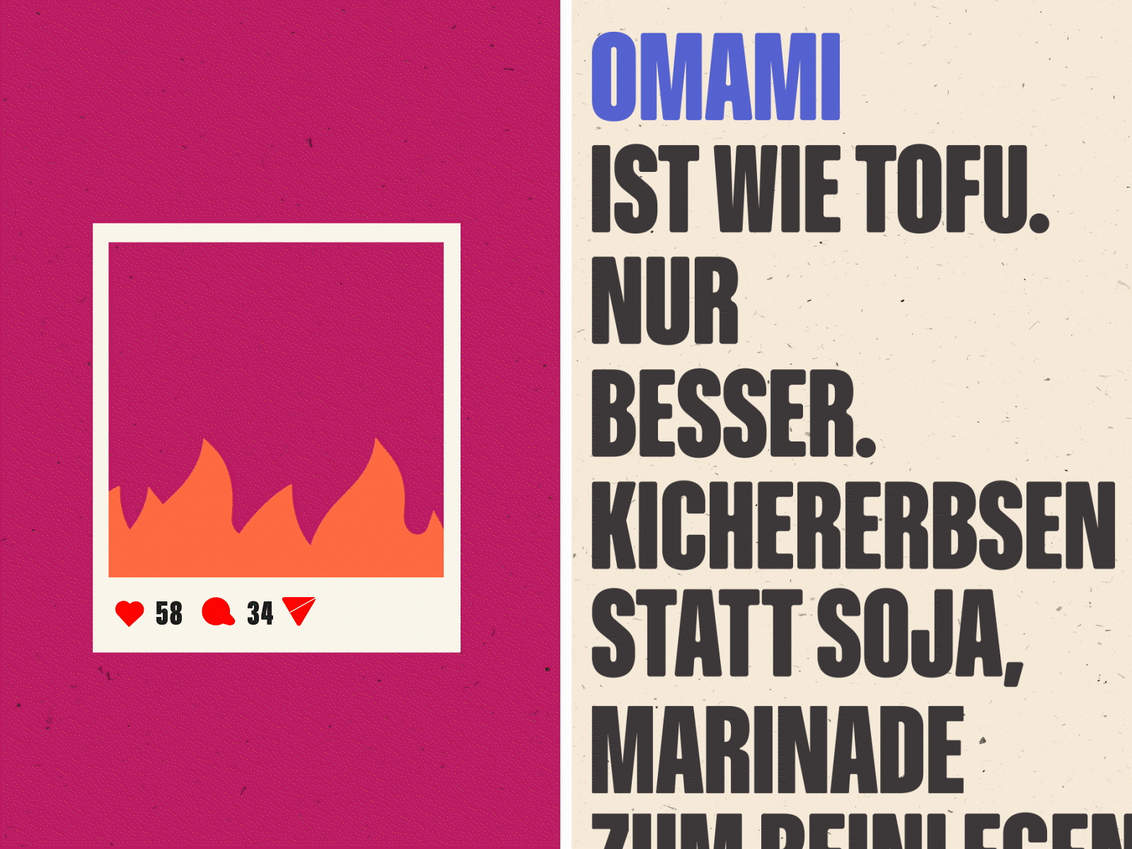
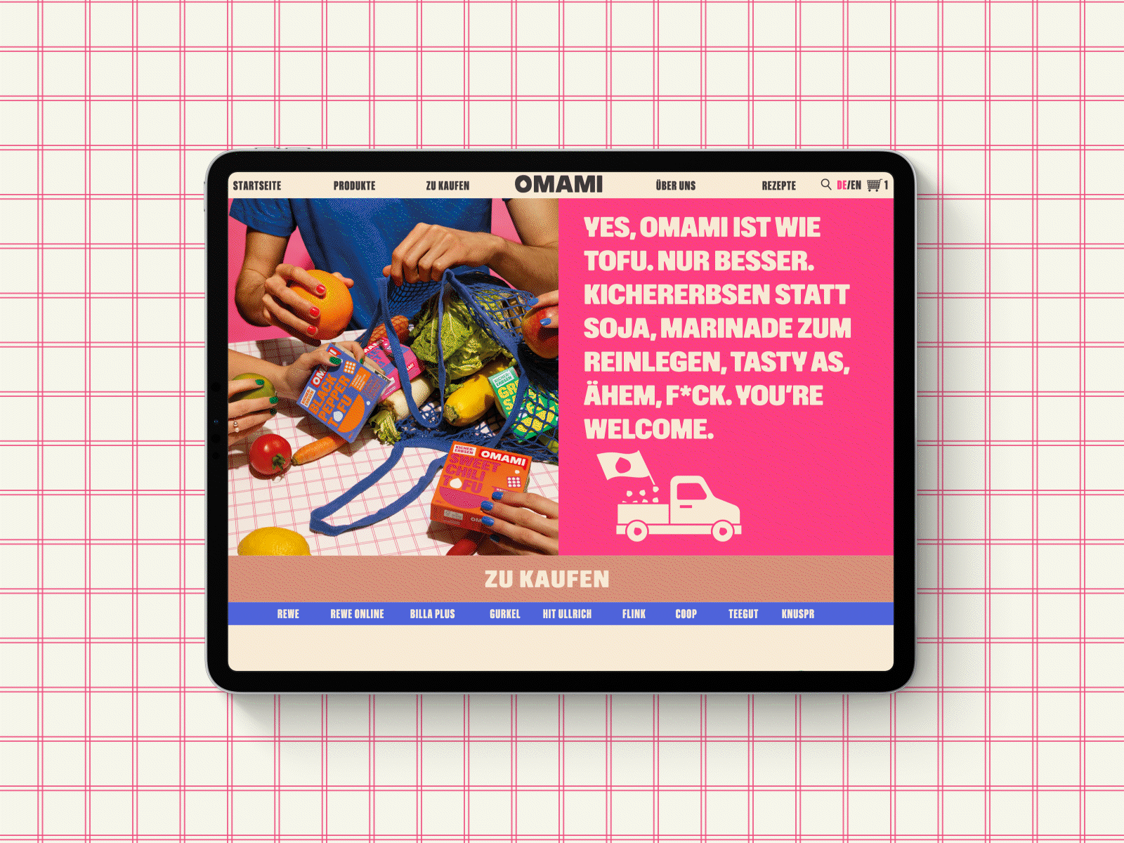
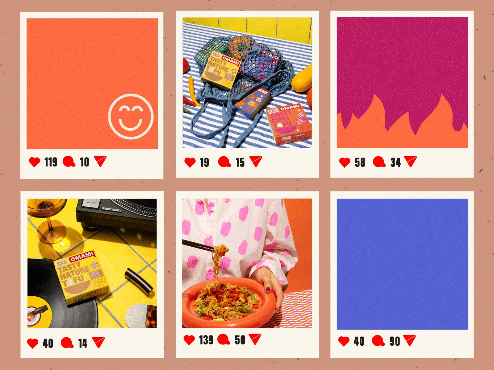
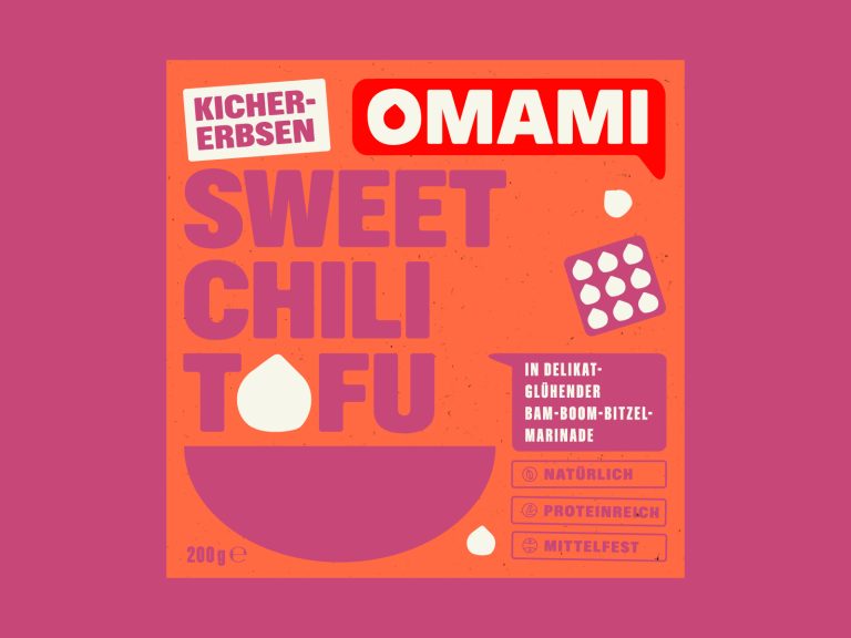
The bold corporate design by Studio Oeding attracts attention on the shelf and breaks away from the usual shades of gray and green. Instead, OMAMI relies on an empowering design with a unique visual identity.
With extensive expertise in design and sustainability, Studio Oeding developed the corporate design, packaging design and communication design for the market launch in Germany, Austria and Switzerland as well as the expansion into the international food market.
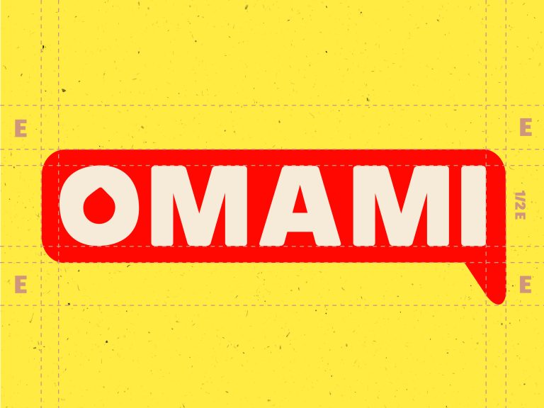
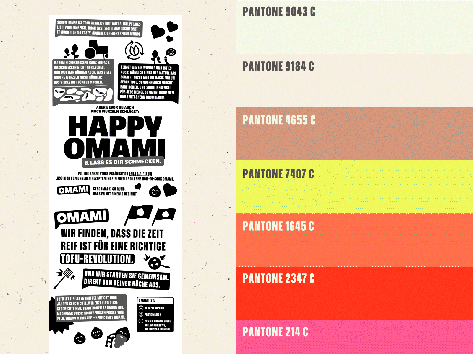
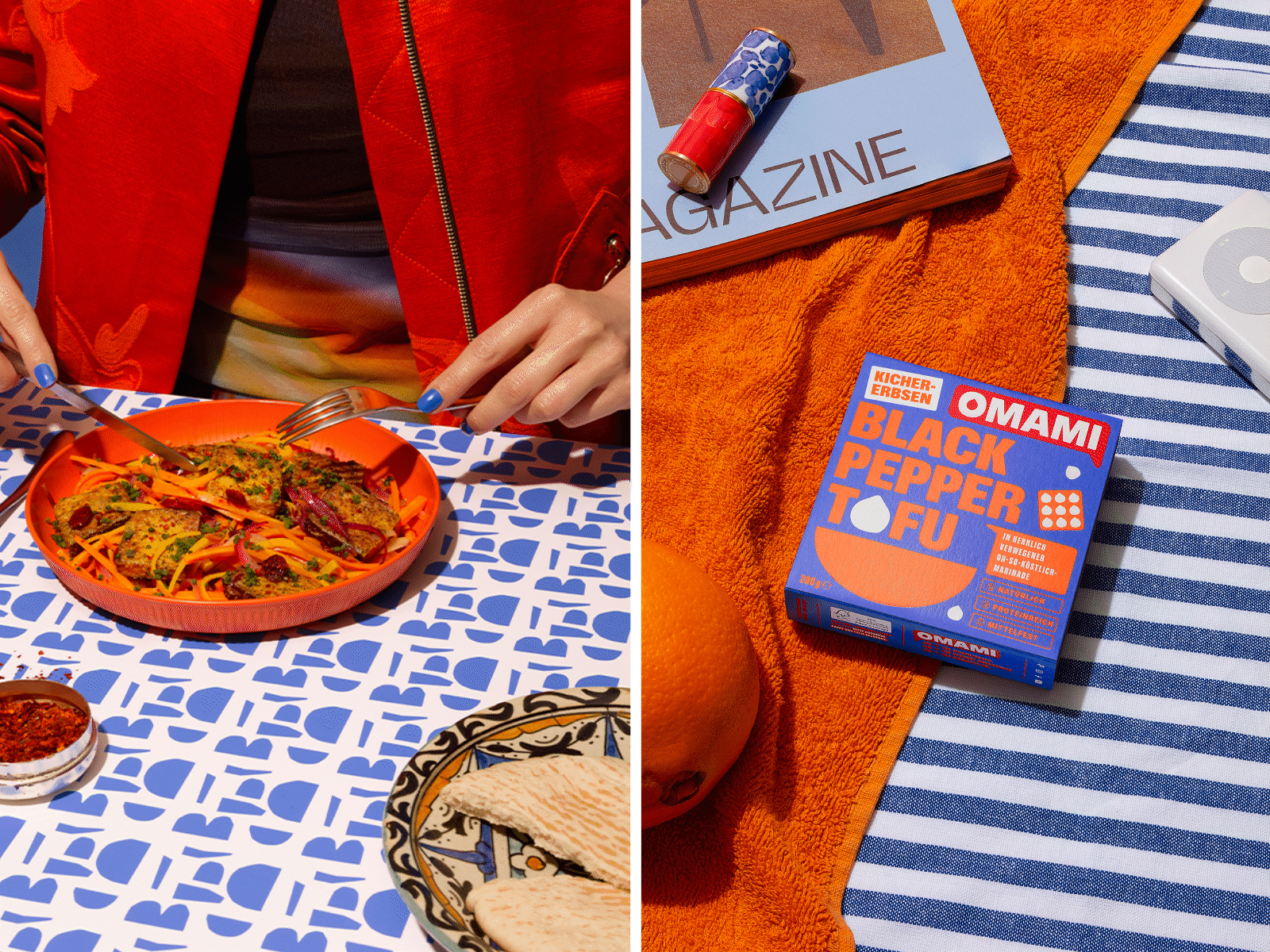
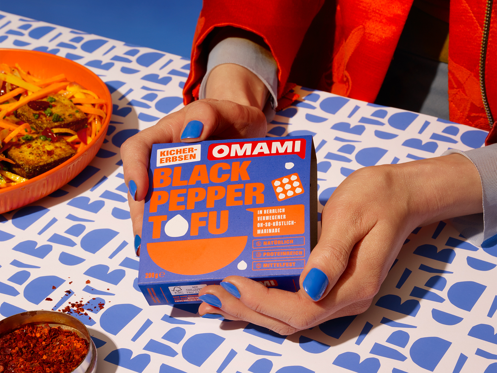
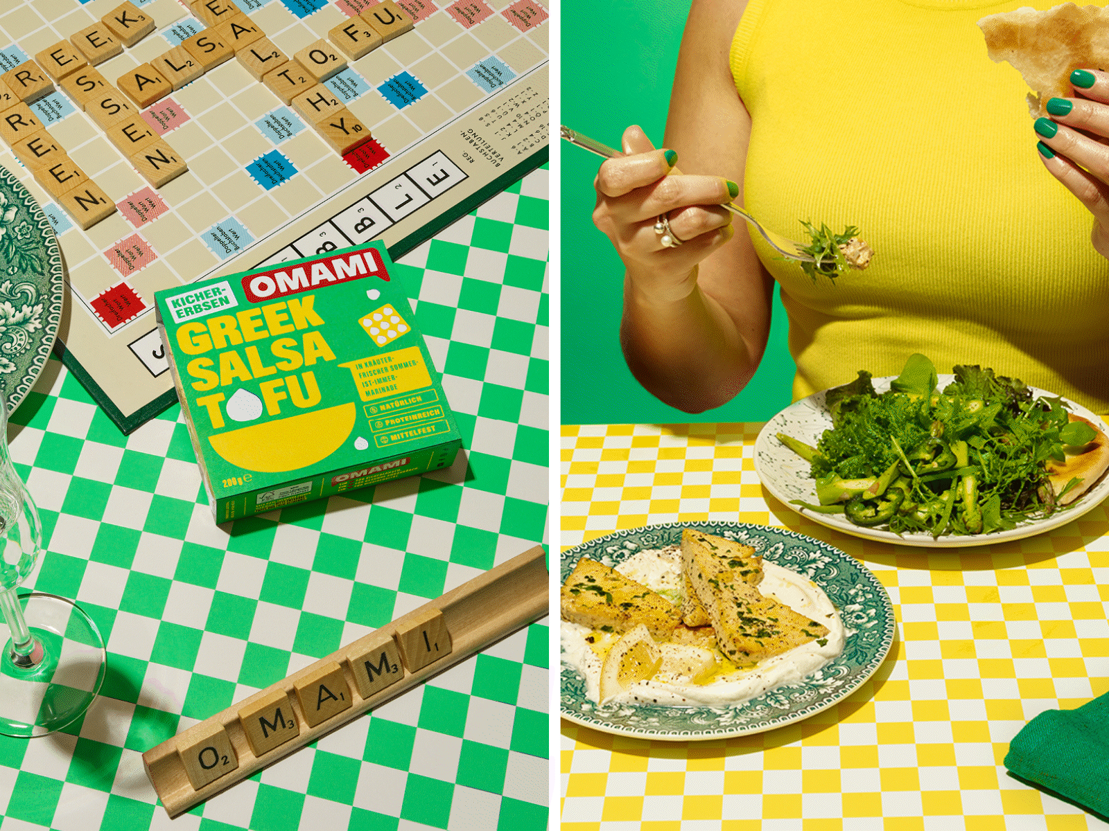
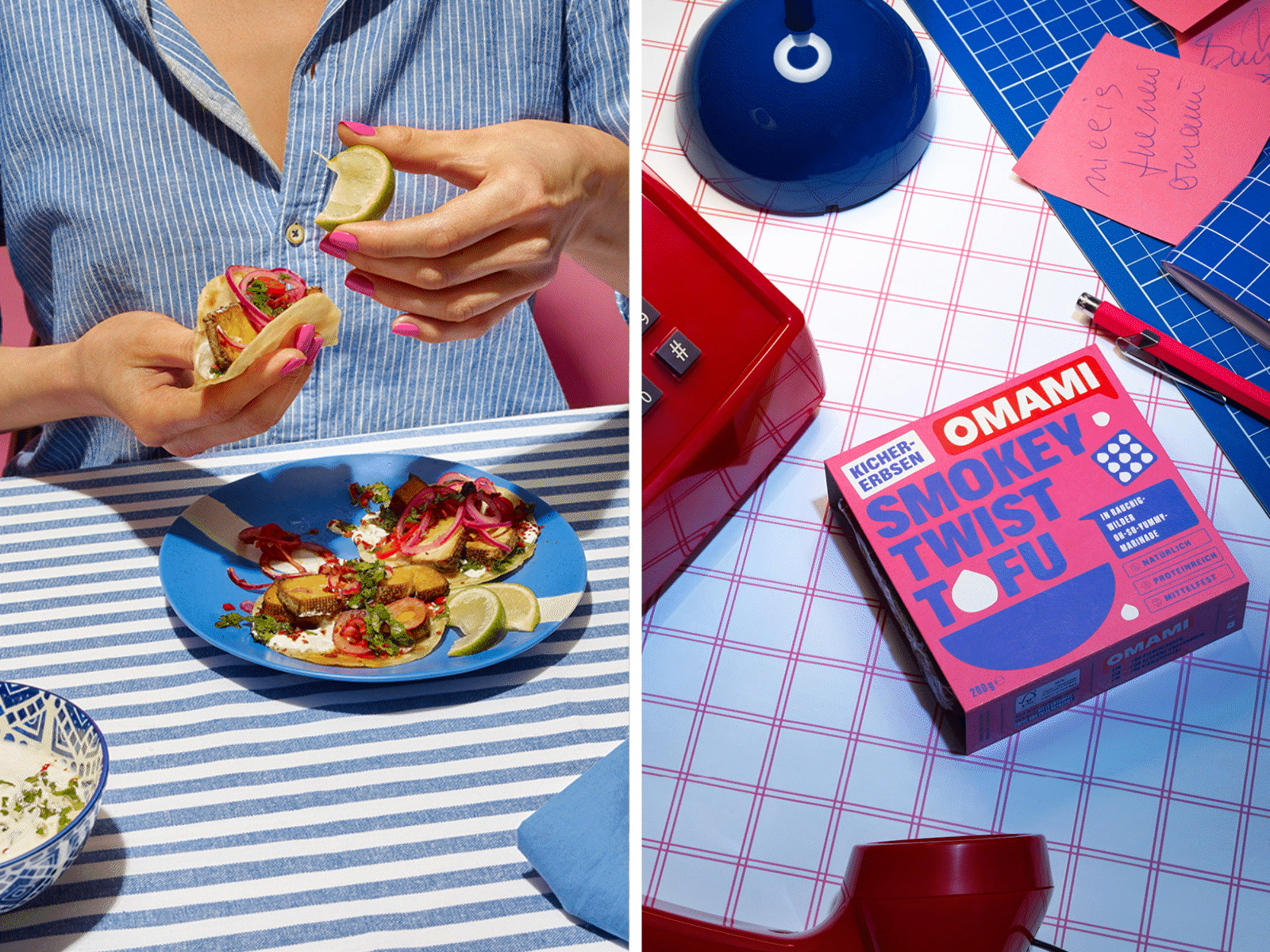
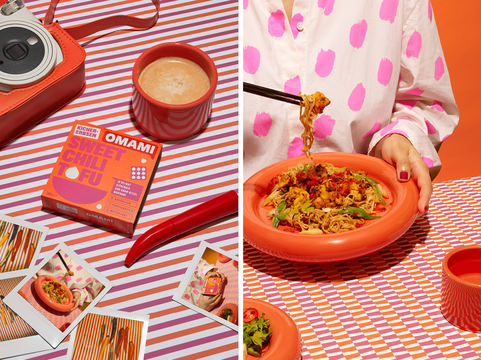
The design concept for OMAMI is based on the following factors: Novelty, taste, joie de vivre and internationality. Studio Oeding focuses on communication: the logo in the form of a speech bubble and the “talking” packaging provide important information about the brand, production and preparation. Preparation tips and recipes promote convenience and a change in food culture. The bold packaging design in an innovative 10 x 10 cm format with intense Pantone colors breaks with the usual color code thanks to Studio Oeding: Sweet Chili Tofu shines in a creamy, fiery orange that emphasizes the spicy-sweet heat of the marinade. Greek Salsa is presented in a fresh green that reflects the summery herb marinade and Texas Roast comes in a smoky campfire red that emphasizes the strong roasted aromas and the hearty BBQ character.
The bold corporate design not only sets the brand apart from the familiar soy tofu category and makes it highly recognizable, but also whets the appetite for modern, creative and plant-based cuisine.