Fusion design for a Copenhagen restaurant
Tiger Lily is a restaurant concept at the 25hours Hotel Paper Island in Copenhagen. It promises a culinary journey through Asia, inspired by the continent’s vibrant flavors and luminous colors.
Task
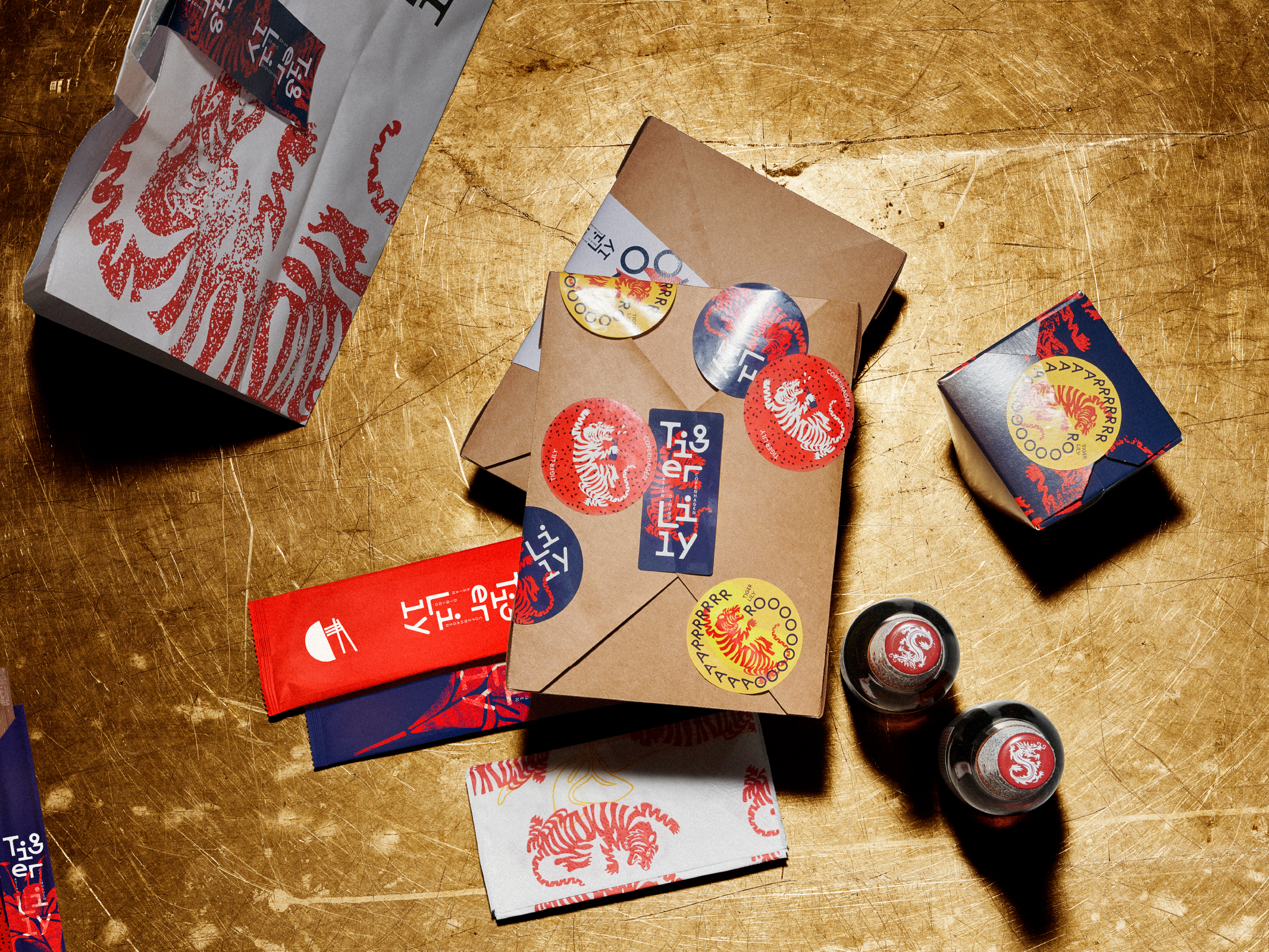
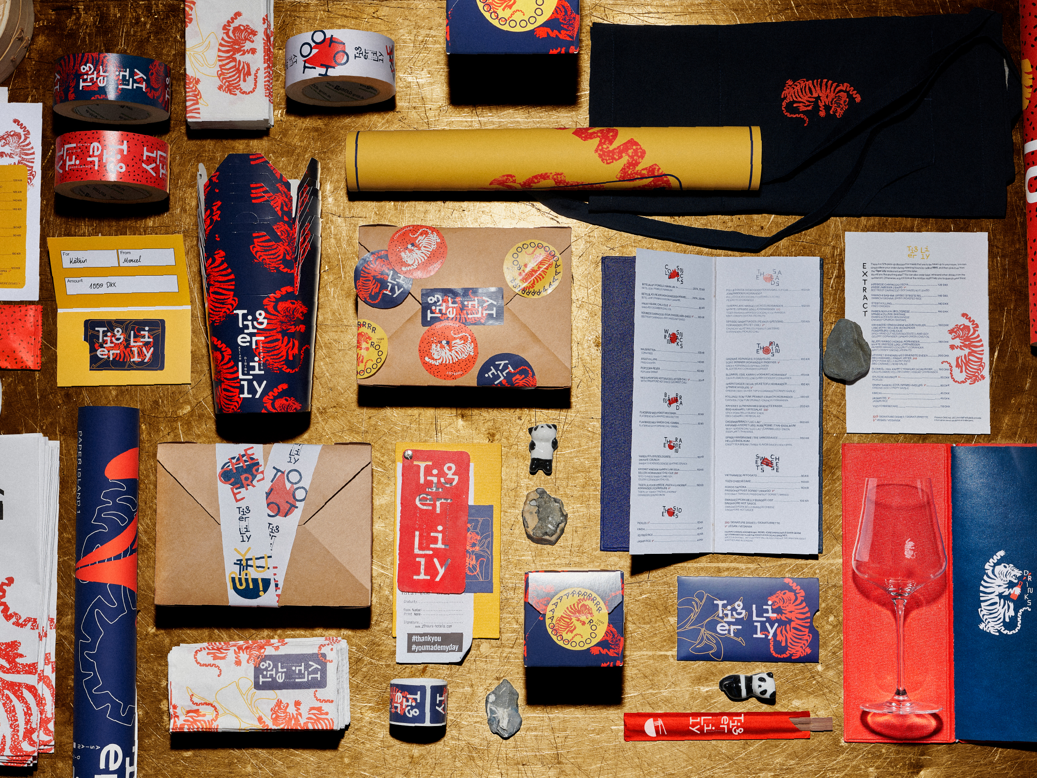
Studio Oeding developed the naming, corporate design, packaging design, communication design, and fashion design for Tiger Lily.
Idea & Concept
The fusion of animal and plant in both naming and design – symbolized by the powerful combination of tiger and lily – reflects the restaurant’s culinary fusion concept, bringing together sensual flavors and contemporary energy for an international audience. Studio Oeding’s design concept was developed as a scalable system, adaptable for future restaurant concepts within the international 25hours Hotels group.
Execution
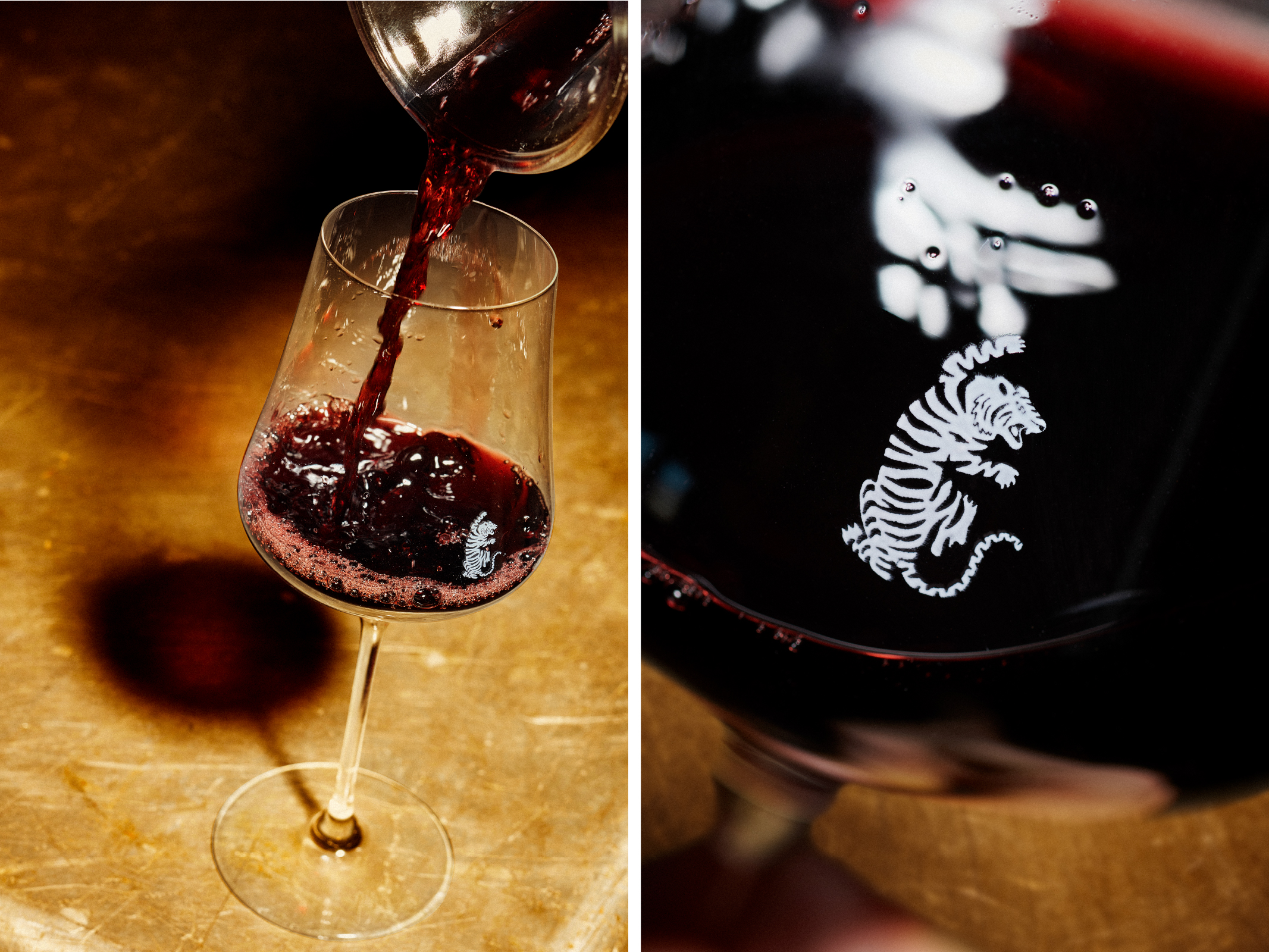
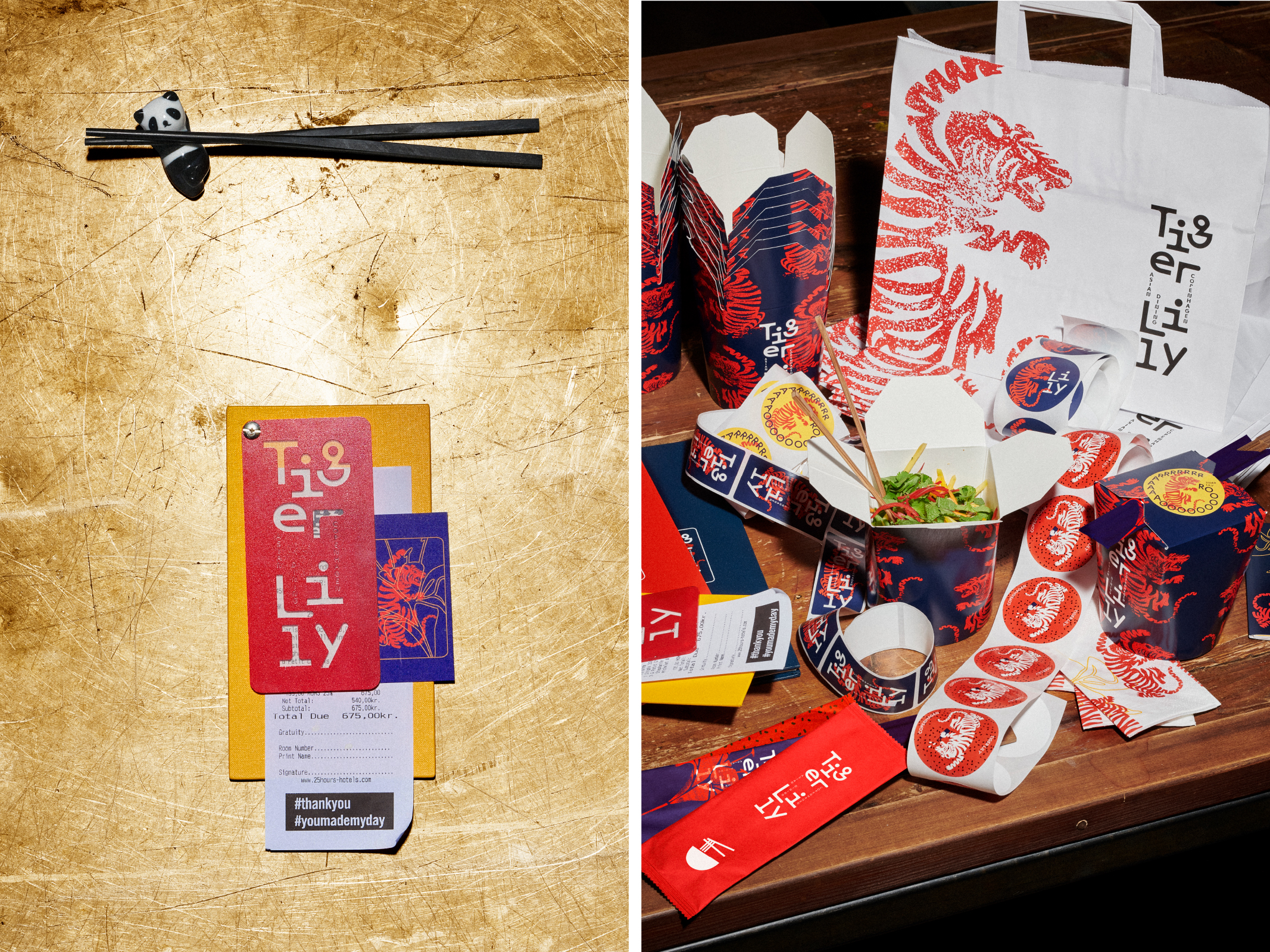
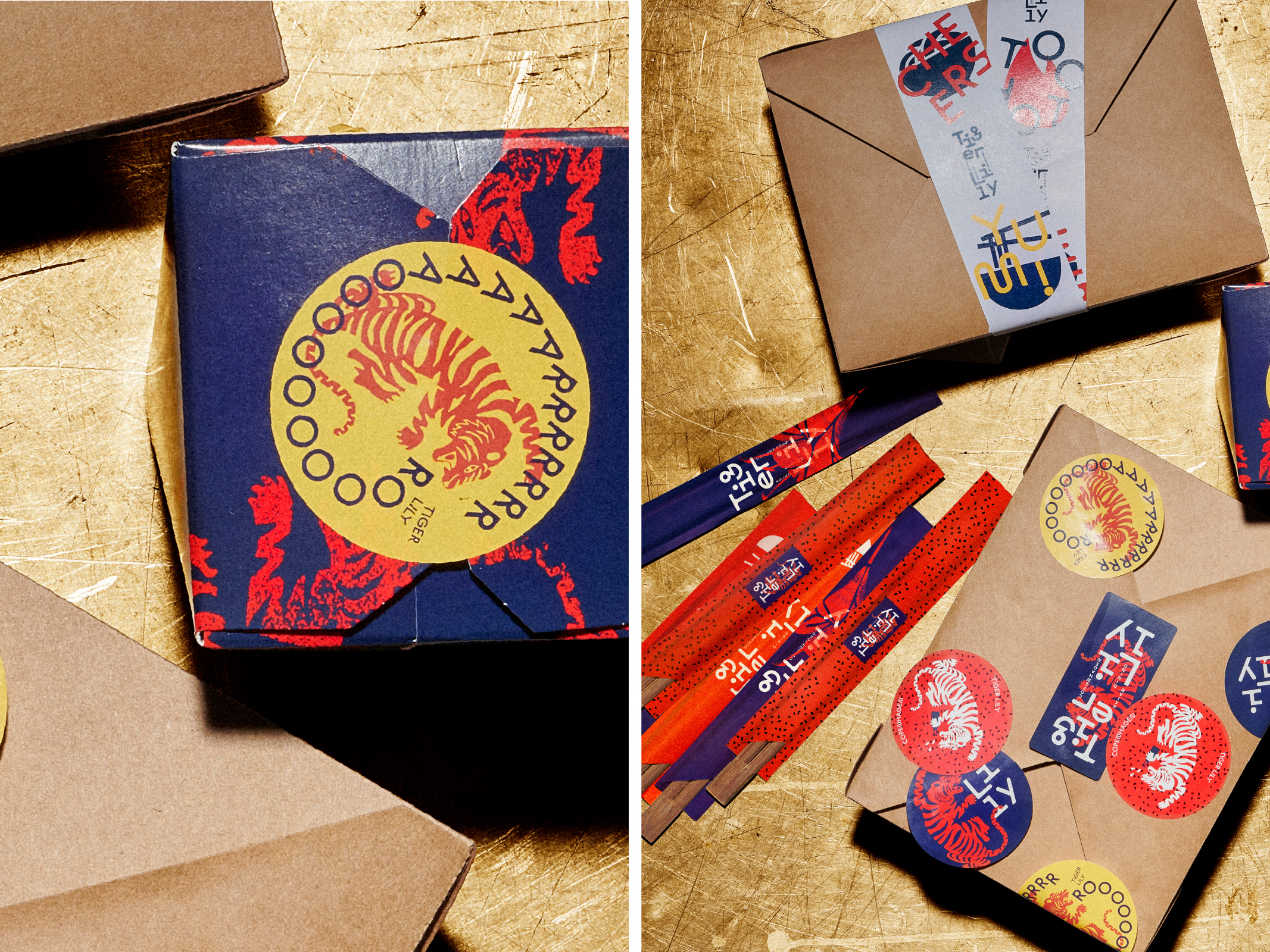
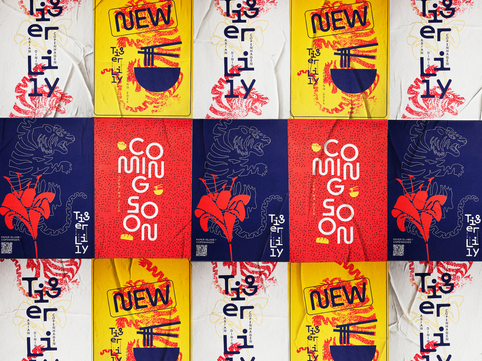
At the heart of the design is the logo, merging the bloom of the tiger lily with the powerful symbolism of the tiger – a fusion of two strong motifs rooted in Asian culture. The tiger lily represents passion, beauty, and sensual flavors, while the tiger stands for strength, attitude, and dynamism.
The corporate color palette reflects the culinary journey through Asia: red symbolizes energy, passion, and the intense spice of Asian cuisine, while yellow conveys warmth, sophistication, and the seductive radiance of refined flavors. White typography on a deep blue background adds a sense of modern clarity.
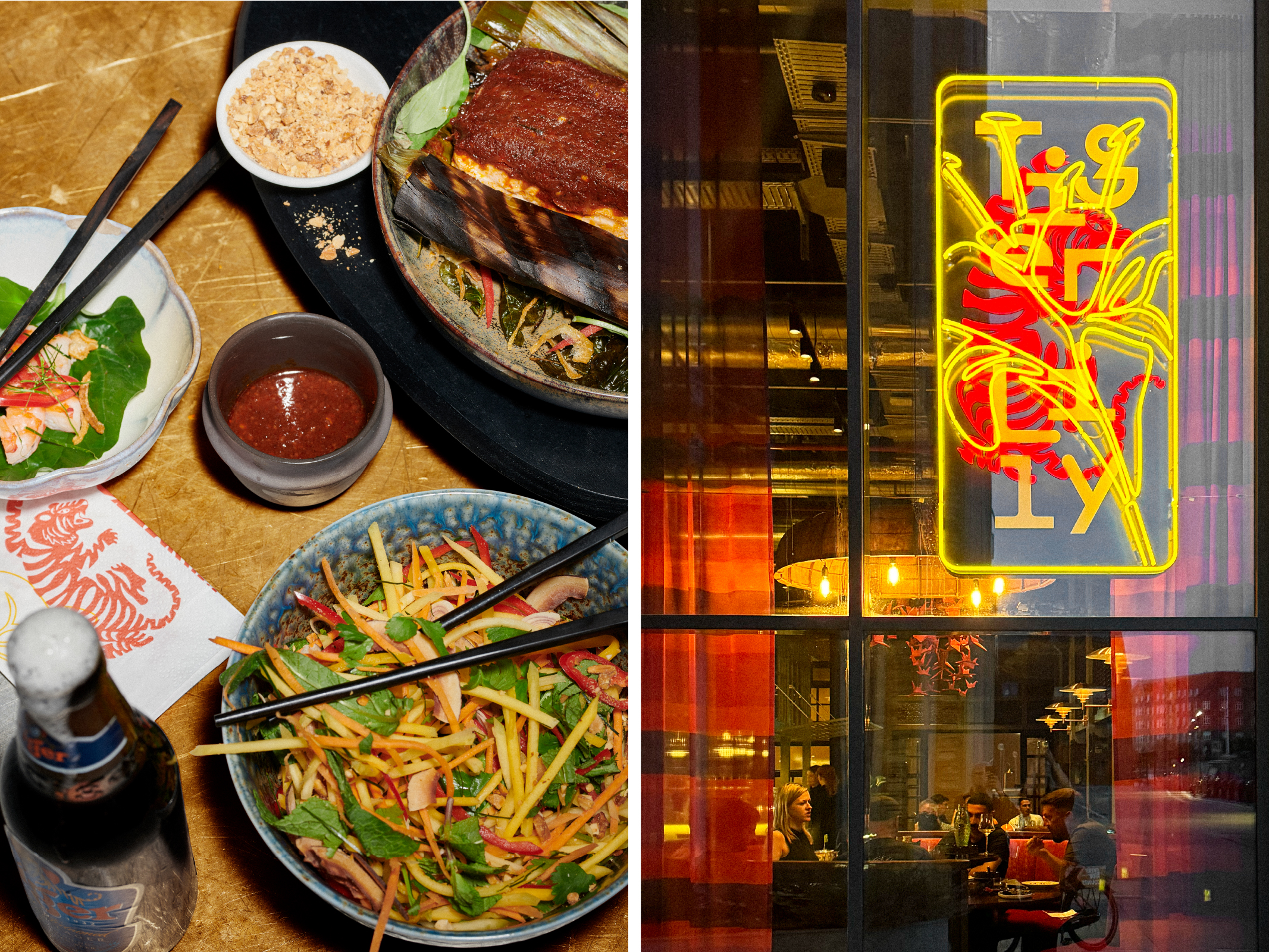
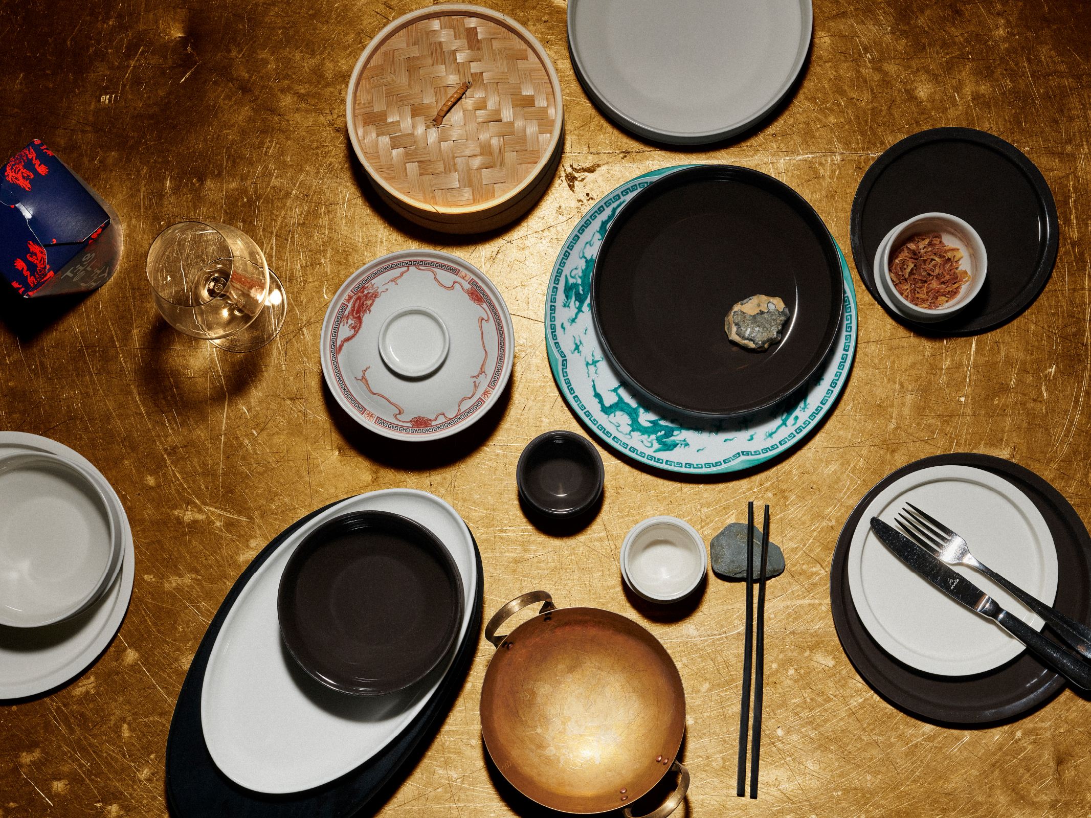
The design system is flexible and dynamic, built around a versatile set of tools that can be continuously reinterpreted – from exclusive custom-designed tableware and fashion to branded napkins and takeaway packaging. The table culture itself reflects Tiger Lily’s fusion philosophy: contemporary design elements meet traditional Asian tableware, brass bowls, and wooden accessories.