Rebranding with radiance
St. Elmo’s was founded in 2001 as a traditional advertising agency and has since evolved into a vibrant collective of curious minds. Today, the company brings together all marketing disciplines – from strategic brand positioning to immersive brand experiences in physical spaces.
Task
Studio Oeding developed a contemporary rebrand for St. Elmo’s that creates clarity while enabling differentiation. The new brand identity works consistently across both B2B and B2C contexts, uniting all business divisions under one shared visual umbrella while still allowing each to remain clearly recognizable as an individual entity.
Idea and Concept
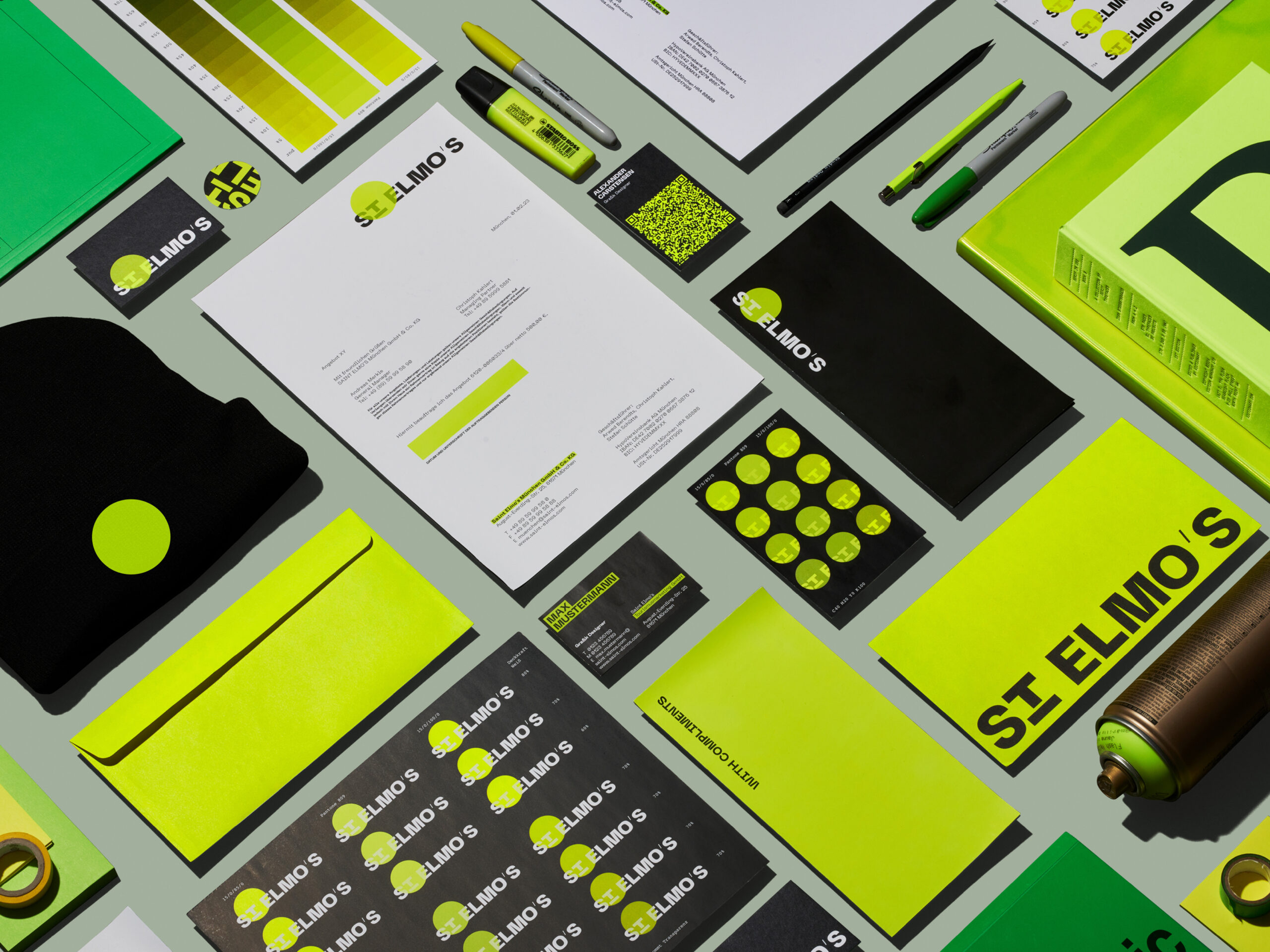
Das Rebranding übersetzt die Philosophie von St. Elmo’s in eine klare visuelle Identität: Die Überzeugung, dass eine The rebrand translates the philosophy of St. Elmo’s into a clear visual identity: the belief that a brand above all needs energy and presence. Inspired by **St. Elmo’s Fire** – the luminous phenomenon that appears when energy builds in the atmosphere – the brand is designed to shine within the vast sea of communication.
Execution
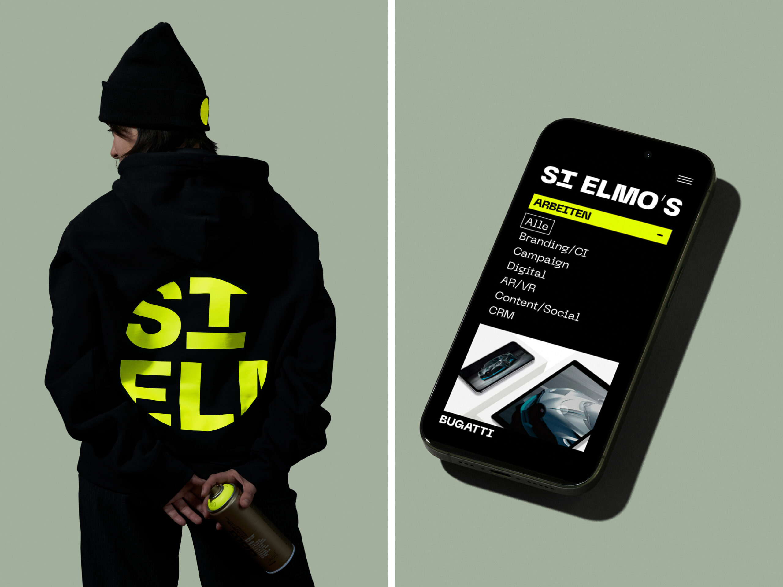
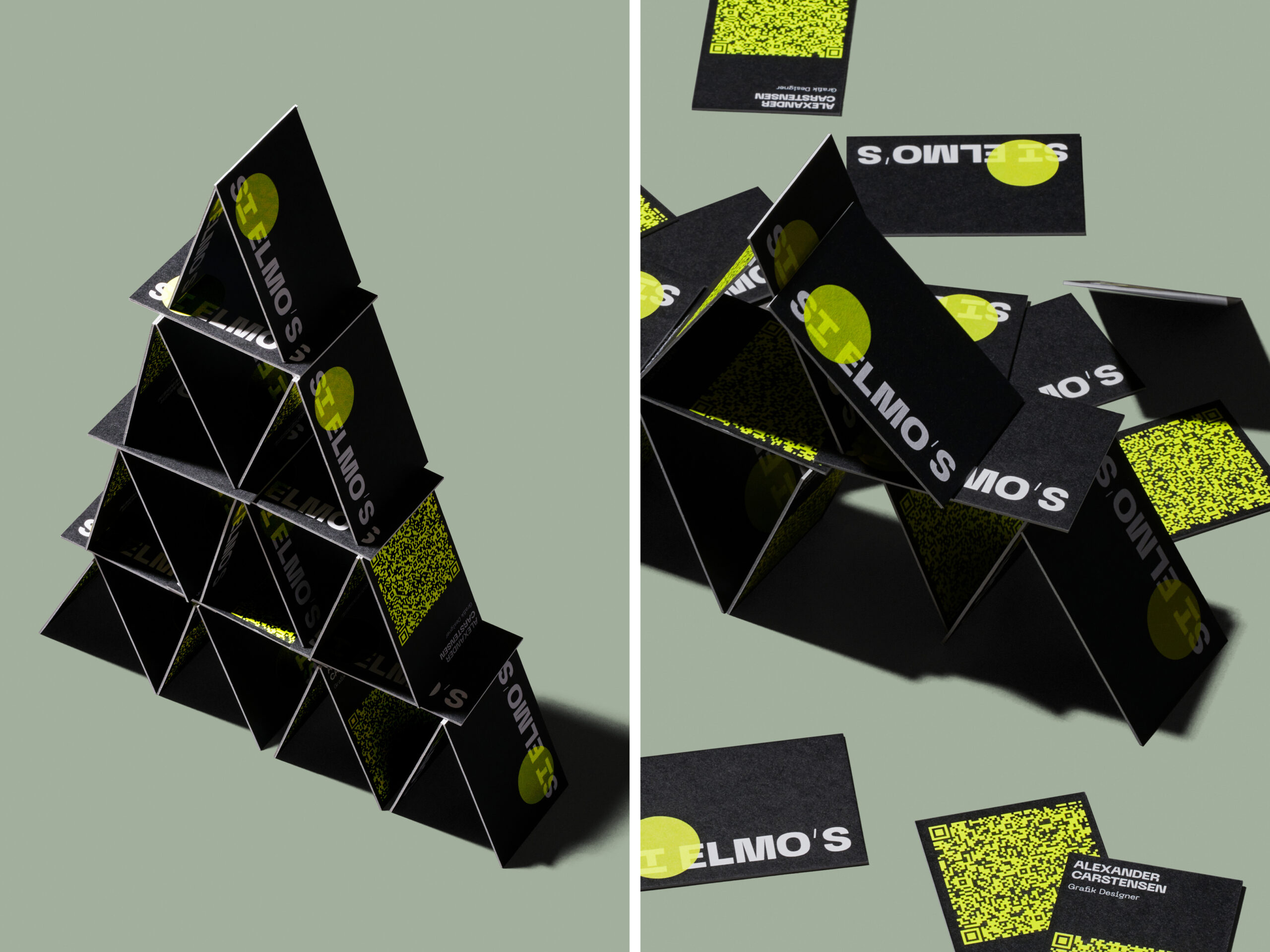
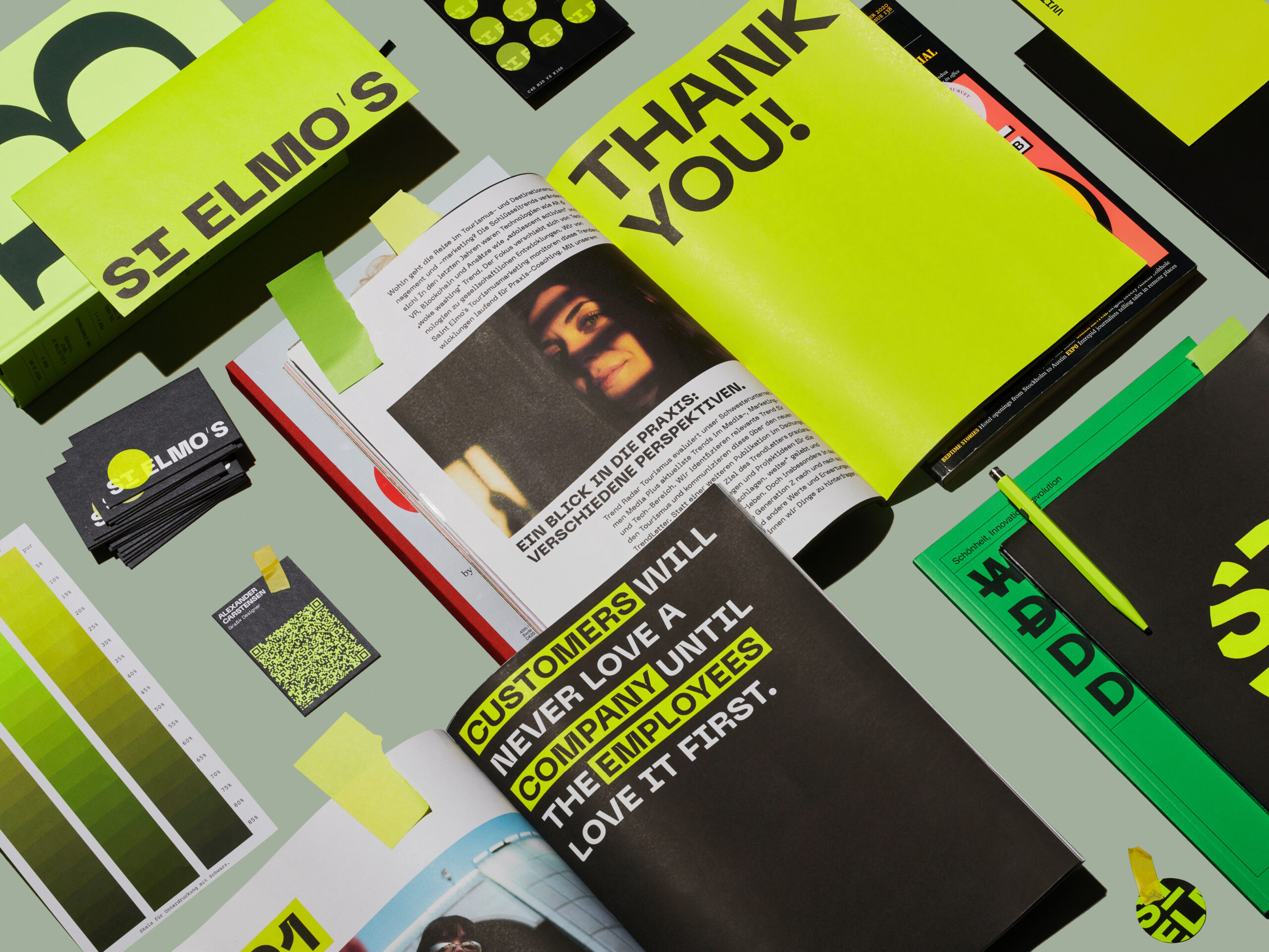
Studio Oeding brings the St. Elmo’s brand to life with a bold corporate design, reduced to the essentials and clearly future-focused. At its core is a glowing neon-yellow dot – like a spotlight that concentrates attention and makes energy visible. The design is distinctive and highly recognizable, yet deeply considered in its complexity, extending consistently down to the smallest applications, including meticulously crafted table layouts. By translating a strong symbolic concept across a wide range of digital and analog touchpoints, a cohesive, radiant, and iconic brand world emerges.
More at: https://saint-elmos.com/