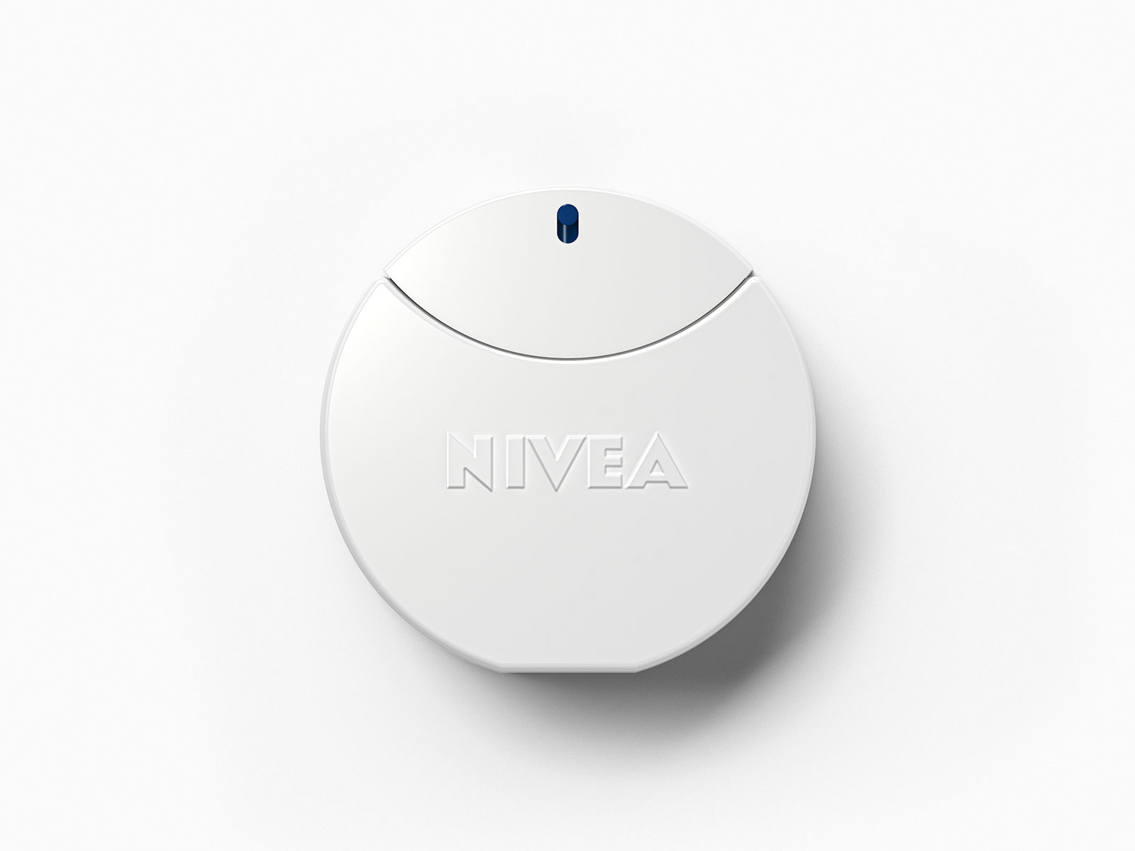
Turning an iconic scent into a new product category.
The unmistakable scent of NIVEA® Cream is one of the brand’s greatest assets. For many people, it is closely associated with childhood, family, and personal memories. In 2014, this inspired the idea of transforming this iconic scent into a standalone product category: NIVEA® Eau de Toilette.
Task
Together with Beiersdorf, we explored the question of which new product categories could be credibly developed under the NIVEA® brand.
From the very beginning, our goal went beyond simply designing a new product. We wanted to develop an idea that would stem directly from the brand’s identity and defining assets and translate them into the product, materials, and production process.
That’s why we took a holistic approach to the entire process: from the product concept to the flacon and packaging, all the way to material selection, design, and industrial production.
Idea and Concept
The idea grew out of one of NIVEA®’s most emotionally resonant brand elements: the cream’s unmistakable scent.
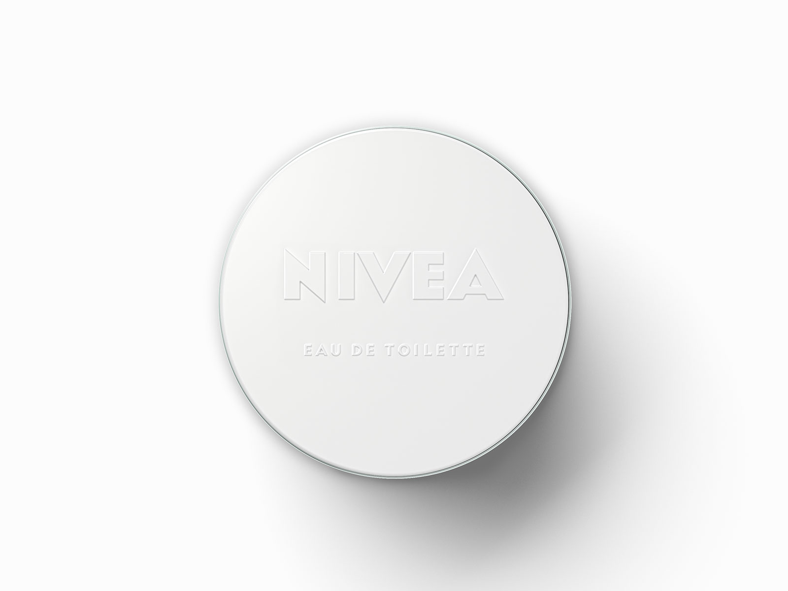
For the flacon, we translated the characteristic design elements of the iconic NIVEA® cream jar into a new product universe. The minimalist, round shape draws on its familiar geometry and consistently evolves it into a glass flacon.
A key design decision was snow white.
While NIVEA® is strongly associated visually with its signature blue, we deliberately chose to focus on the white color of the cream. This color creates a direct connection to the product and, at the same time, to the origin of the brand name: “Nivea” means “snow-white” in Latin.
Snow white represents more than just origin. The color conveys purity, gentleness, and care, thereby capturing the brand’s core qualities in a design that is as simple as it is striking.
In this way, shape, color, and scent connect NIVEA®’s heritage with a new product category, creating a sense of familiarity without simply replicating what already exists.
Execution
Our design process did not end with the initial concept. The bottle, packaging, materials, construction, and production were conceived as a cohesive development process and were overseen through to industrial implementation.
We broke new technical ground, especially with the glass. The NIVEA® logo was not to be printed on the glass, but rather to emerge as a raised element directly from the glass itself. To achieve this, it had to be precisely formed during the glass-casting process.
At the same time, we wanted to incorporate recycled glass into the design. At that point, combining recycled glass with a precisely crafted, raised logo was not yet technically feasible. Together with our production partners, we developed a solution that made this design vision a reality.
Recycled materials were also used in the production of plastic and paper.
We didn’t start by designing something and then look for a way to produce it. The product concept, design, materials, construction, and production were all developed together from the very beginning.
The result is a product that embodies the NIVEA® identity down to the last detail and exemplifies our design approach: from the initial idea to the finished product.