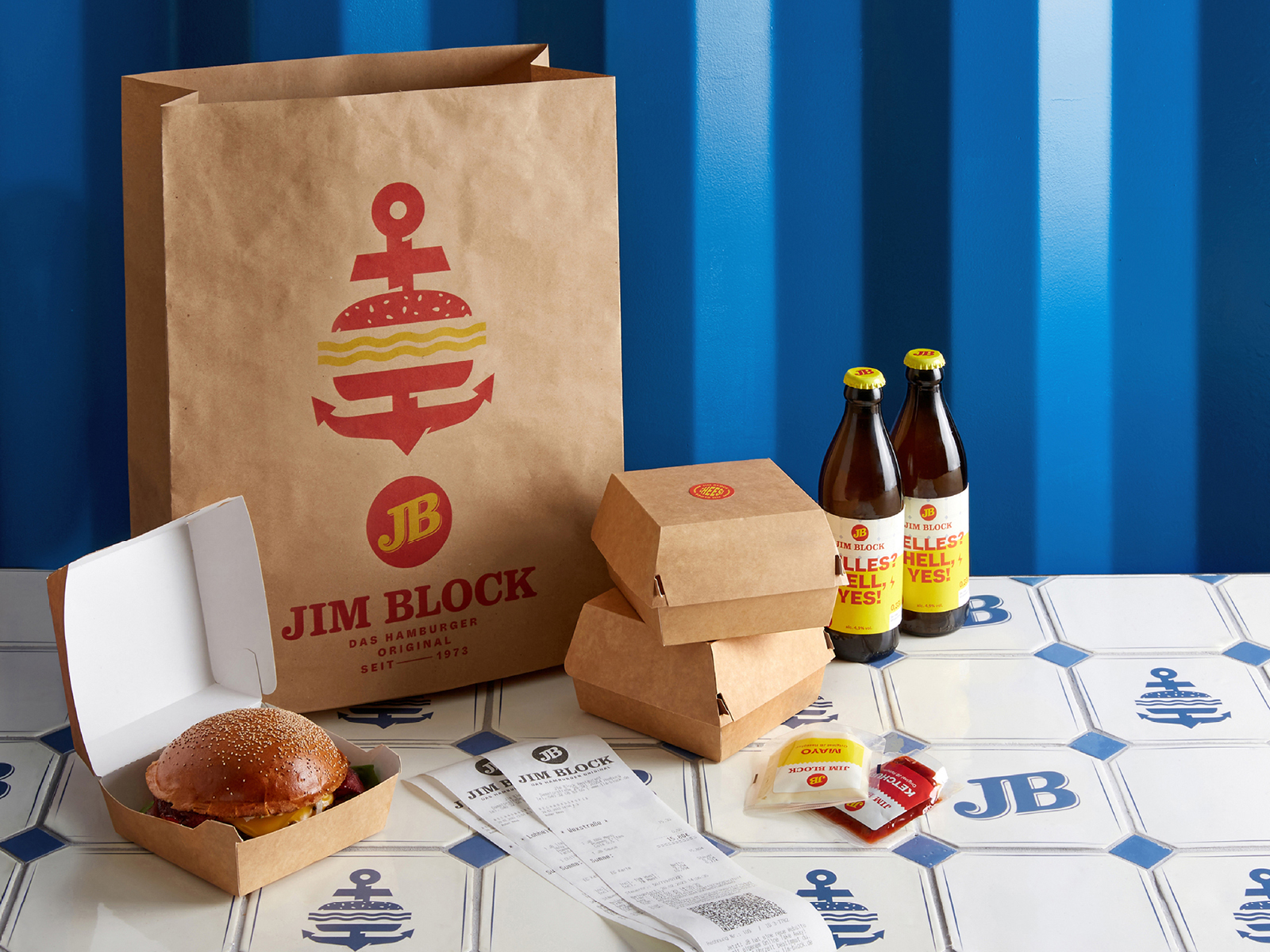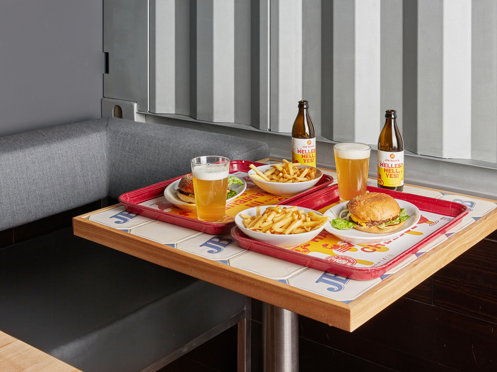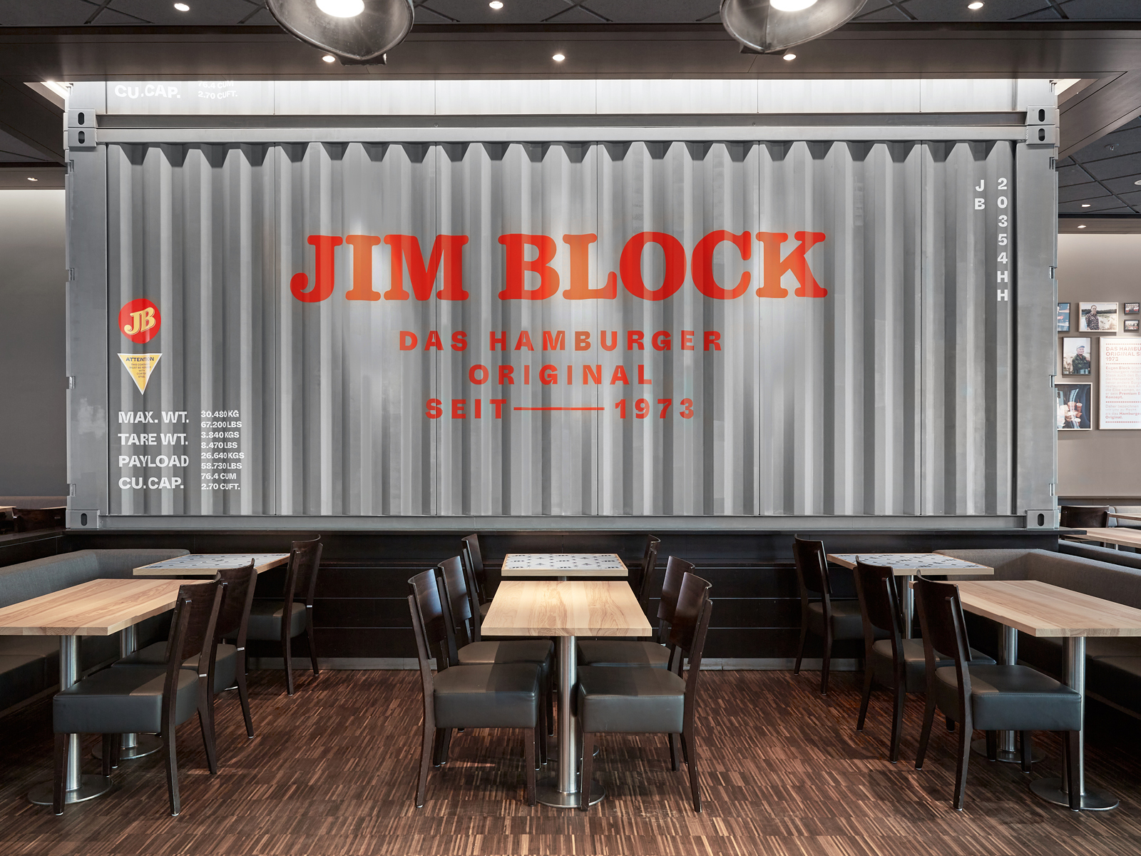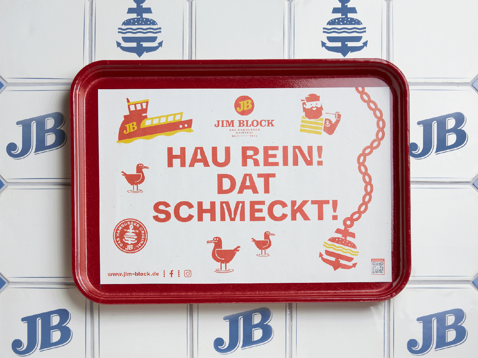
Das Hamburger Original seit 1973.
Bereits 1973 eröffnete Eugen Block das erste Burger-Schnellrestaurant in Hamburg und ist bis heute als das Hambiurger Original erfolgreich im deutschen Markt. Hier werden qualitativ hochwertige Burger mit Erfahrung und Leidenschaft der Mitarbeiter zum echten Genusserlebnis in Wohlfühl-Atmosphäre.
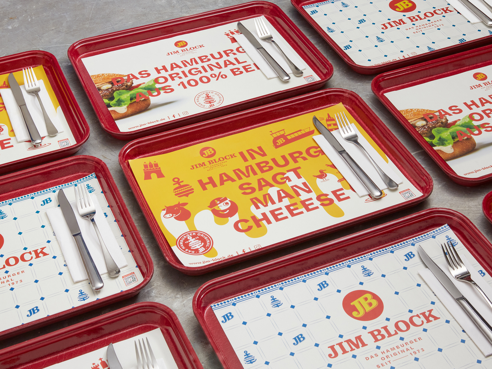
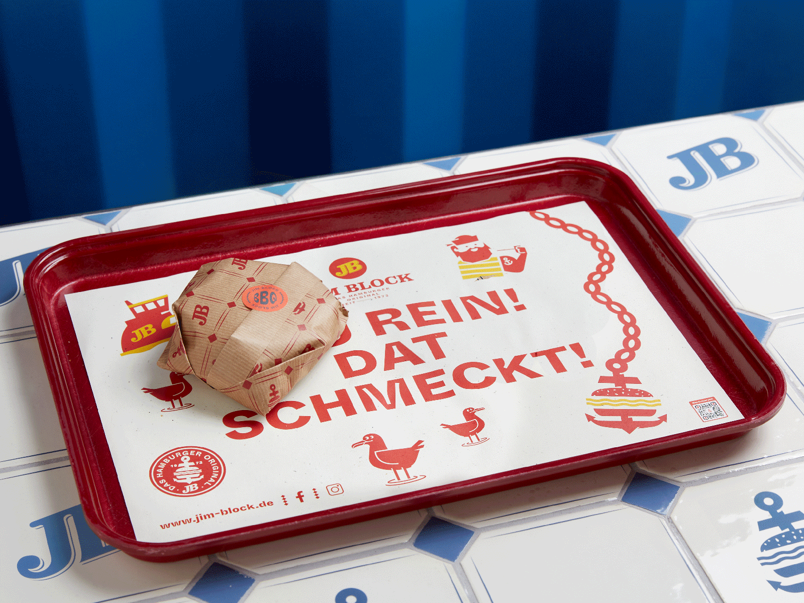
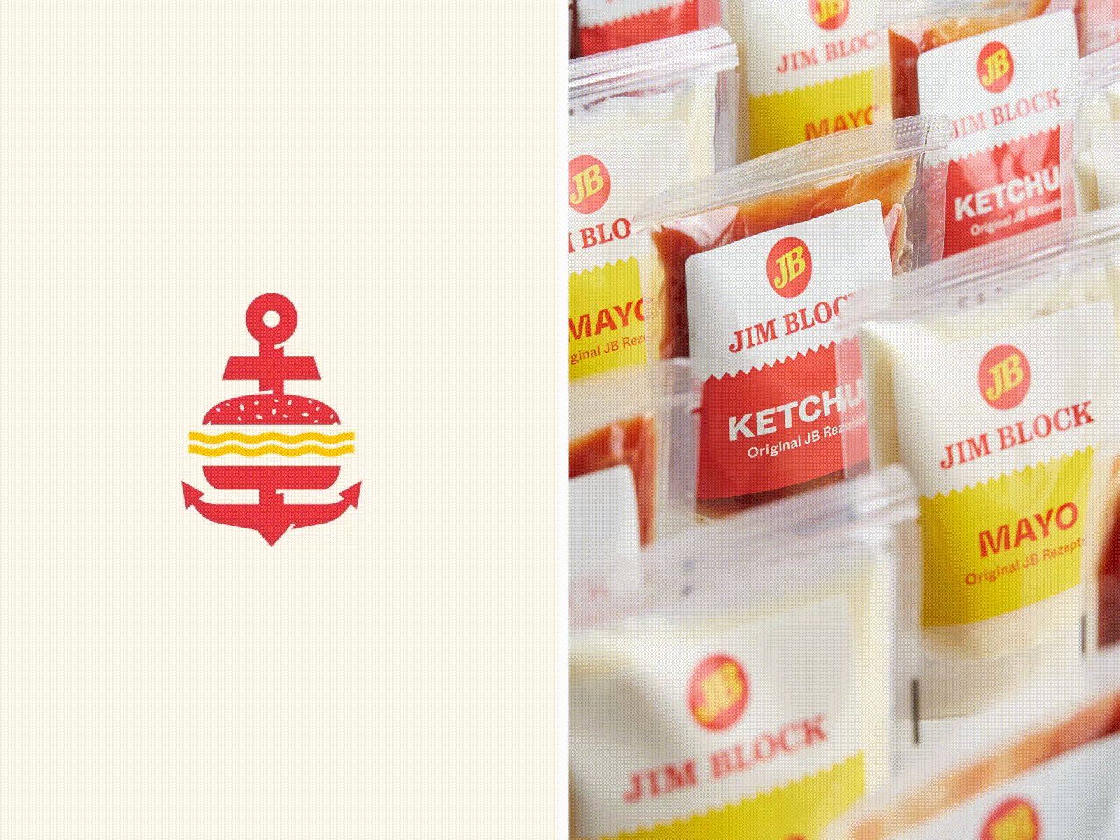
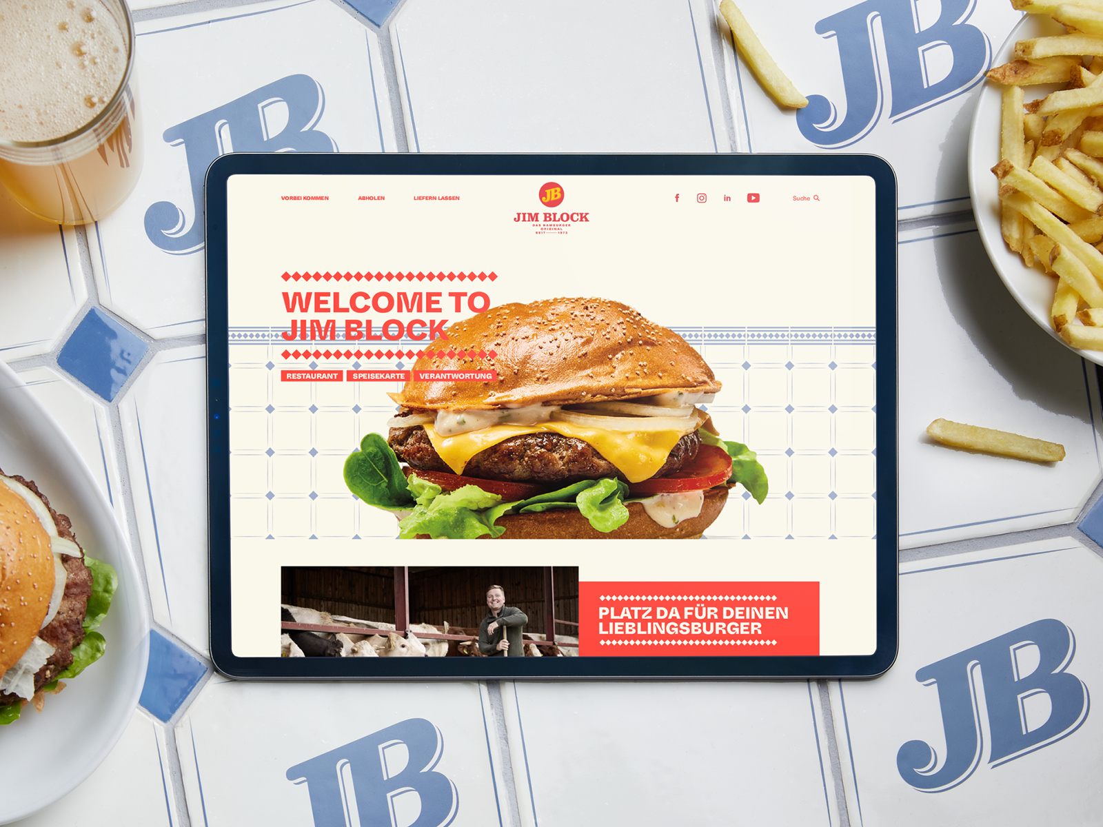
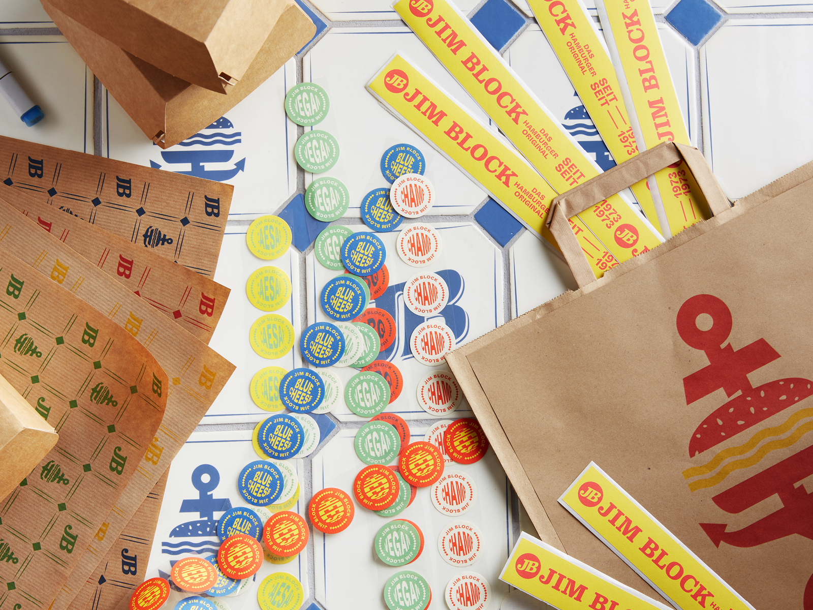
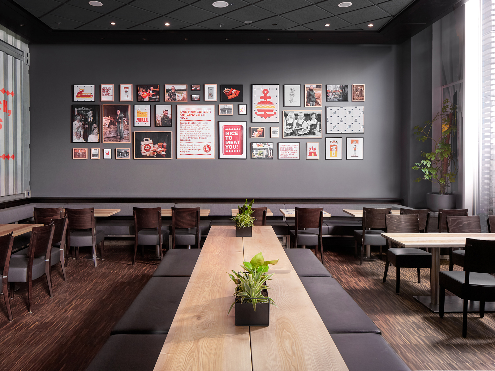
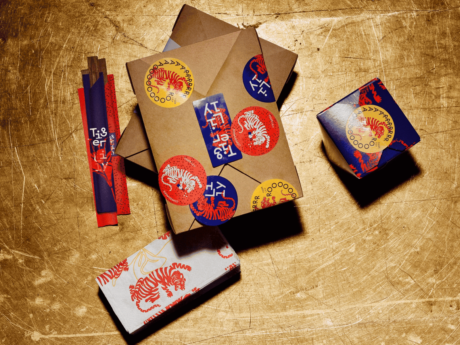
Studio Oeding entwickelte die Strategie zum Markenrelaunch mit dem Ziel „Back to the roots“ mit zeitgemäßer Visual Identity.
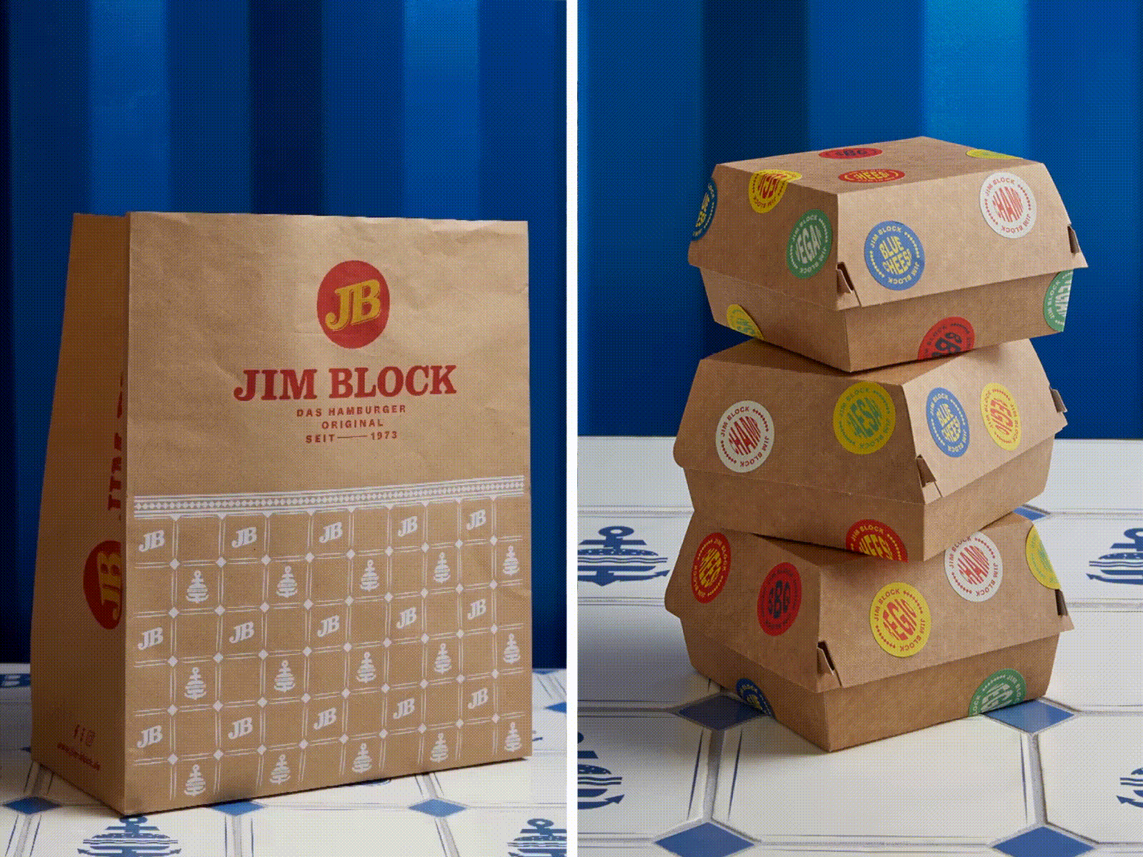
Studio Oeding überarbeitete die Positionierung des Unternehmens zusammen mit dem Jim Block-Markenteam und der Geschäftsführung. Der Schwerpunkt waren die Markenwerte und Markenpersönlichkeit aber auch die Potentiale zur Differenzierung in einem umkämpften Market. So legten sie die perfekte Grundlage für die Transformation der Marke. Das Corporate Design wurde von Studio Oeding konsequent in allen Facetten designt und realisiert – von Logo Design, Typografie, und Ikonografie bis zum Packaging Design, Interface Design und Corporate Fashion sowie Corporate Architecture zusammen mit Studio Istland. Das Fresh-up im Farbkonzept wurde ergänzt durch eine neue illustrative Bildsprache mit typischen Hamburger Merkmalen, die die Heimat der Marke repräsentieren. Die Implementierung des Designs fand onmichannel statt, sodass der Markenrelaunch für den Kunden ein holistisches Erlebnis in allen Kanälen wird.